
POSITIONING GREEN ENERGY AS A MORE AFFORDABLE ALTERNATIVE
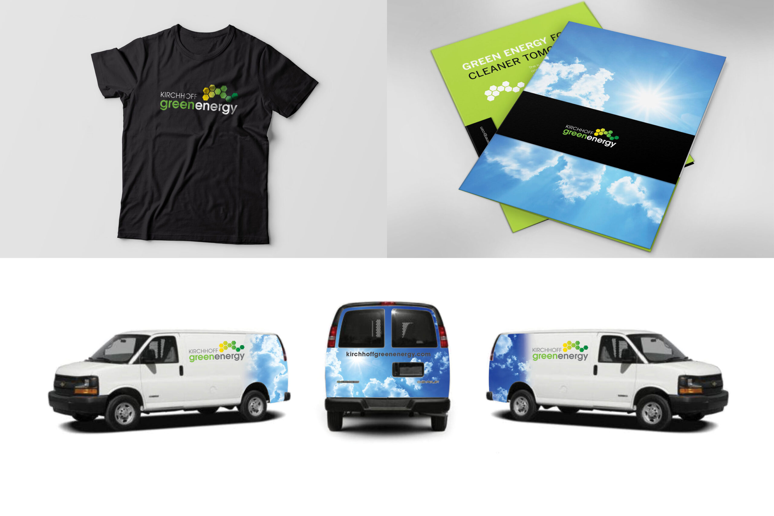
Renewable energy is a complicated thing to sell. In reality wind, solar and geothermal are all quite different so what unites them? When Kirchhoff Green Energy asked Go Gladys to unify their business under one set of brand imagery, we chose to show both the technology and the natural sources that will secure a place for green energy in our economy and our planet’s future. Using building blocks of energy graphic and colors of sunshine and green we created a fresh and energetic branding system.


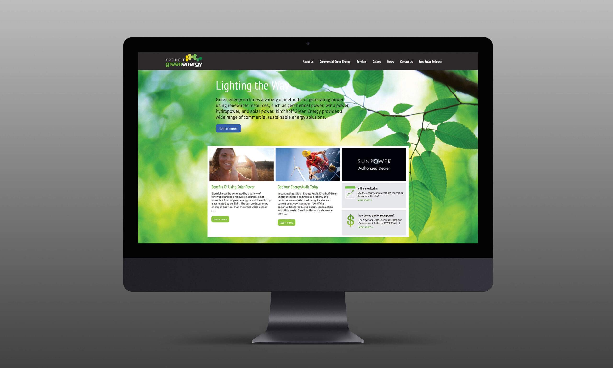
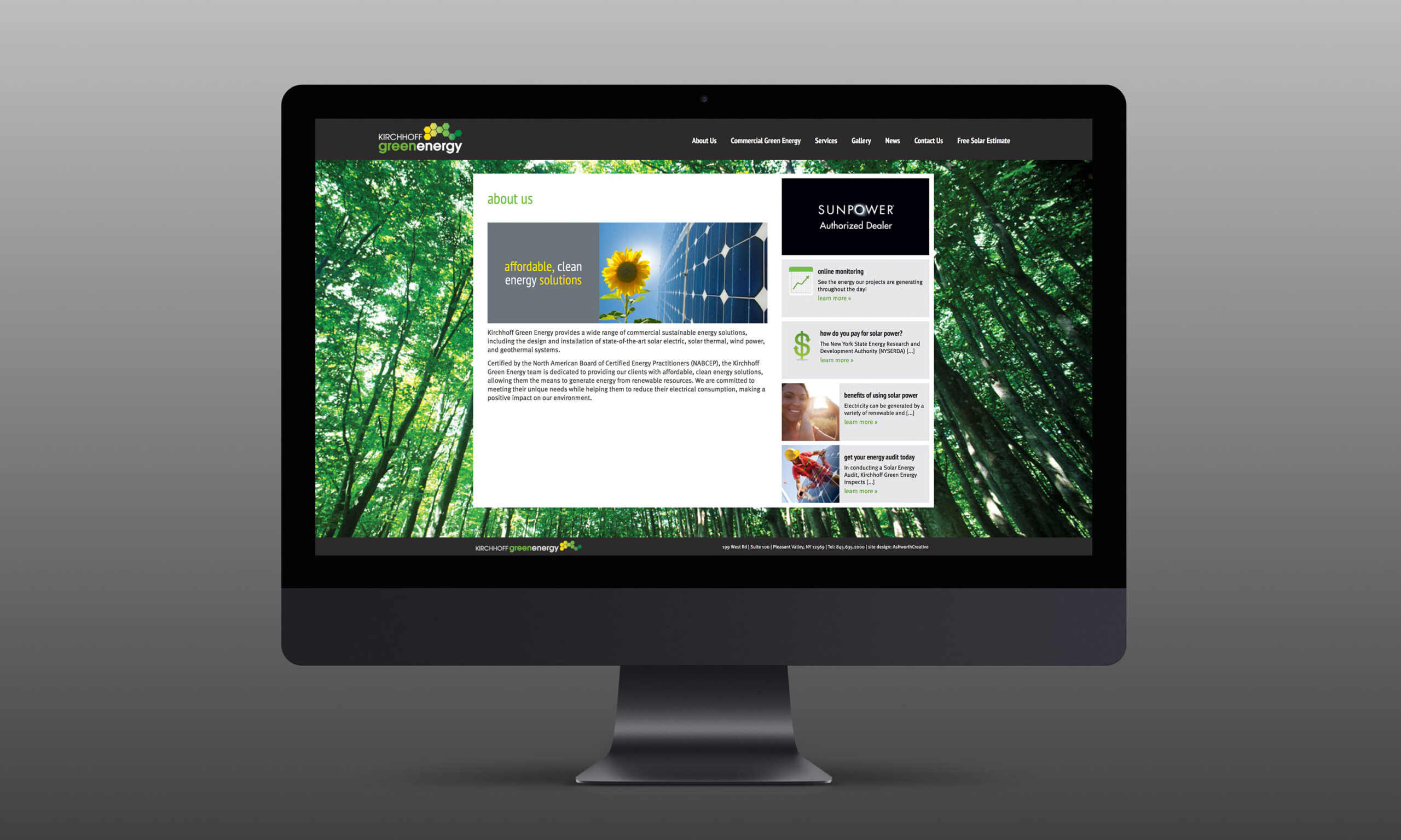
ORCHESTRATING THE BRAND IMAGE THROUGH ALL COMMUNICATION STREAMS
We took the elements of the logo graphic and used it as a unifying mark in print, vehicle signage, stationery and ultimately to building a functional, user friendly and classic website. Using green and yellow, signifying earth and sun, every element in the campaign has a fresh, vibrant and compelling corporate image.
STREAMLINED BRANDING CLARIFIES CORPORATE MISSION
With new and streamlined corporate branding, Kirchhoff Green Energy has been able to consistently and effectively communicate the tenets of their mission to clients. The crisp design of their website, print content and various platforms exudes clean energy, affordability, and symbiosis with our planet.